Transforming a legacy app into a reliable training tool
A six-month framework deprecation deadline pushed me to revamp a cluttered app into a simplified tool. By retiring underused features, introducing a scalable design system, and transitioning to a web app, the new platform led to a steady increase in user visits along with a decline in support requests while safeguarding user access to TalentLink.
+13%
WEEKLY APP VISITS
-70%
SUPPORT TICKETS
3
DEPRECATED FEATURES
Company: TalentLink
Timeframe: 5 months
Role: Lead Product Designer
Team: Project manager, full-stack engineers, marketing manager
App Reach: ~30K users
Problem
Thousands of frontline employees risked losing access to critical on-the-go training due to a six-month framework deprecation deadline. The legacy mobile app suffered from unidentified system errors, broken installation flows, and poor content discoverability, all of which daily threatened operational consistency and employee performance.
Solution
I led the user experience transition from a failing mobile framework to a high-performance web app, eliminating installation friction and ensuring cross-platform stability. By overhauling the information architecture and implementing a design system, I resolved long-standing usability and discoverability issues. Finally, I used research to identify and retire low-value features, which removed persistent system errors and reduced support overhead. This transformation turned a cluttered legacy tool into an optimized operational tool that ensured uninterrupted access for thousands of learners within the six-month deadline.

Design Process
Project Challenges
- Backend technology limitations that might impact information display
- Unstable backend causing development bugs
- Engineering team new to React
- Communicating and negotiating the deprecation of features with stakeholders
Research and Analysis
I mapped the current solution to clarify the existing experience, enabling internal stakeholders to visualize all key screens and friction points throughout the user journey, as reported by the support team. I also conducted a Heuristic analysis of key flows, which helped reveal inconsistencies in the UI and incorrect use of affordances.
This collaborative exercise, plus a series of user interviews, revealed three key findings:
- The app was misaligned with its core value proposition: empowering users to identify pending training, prioritize tasks, and complete them on time.
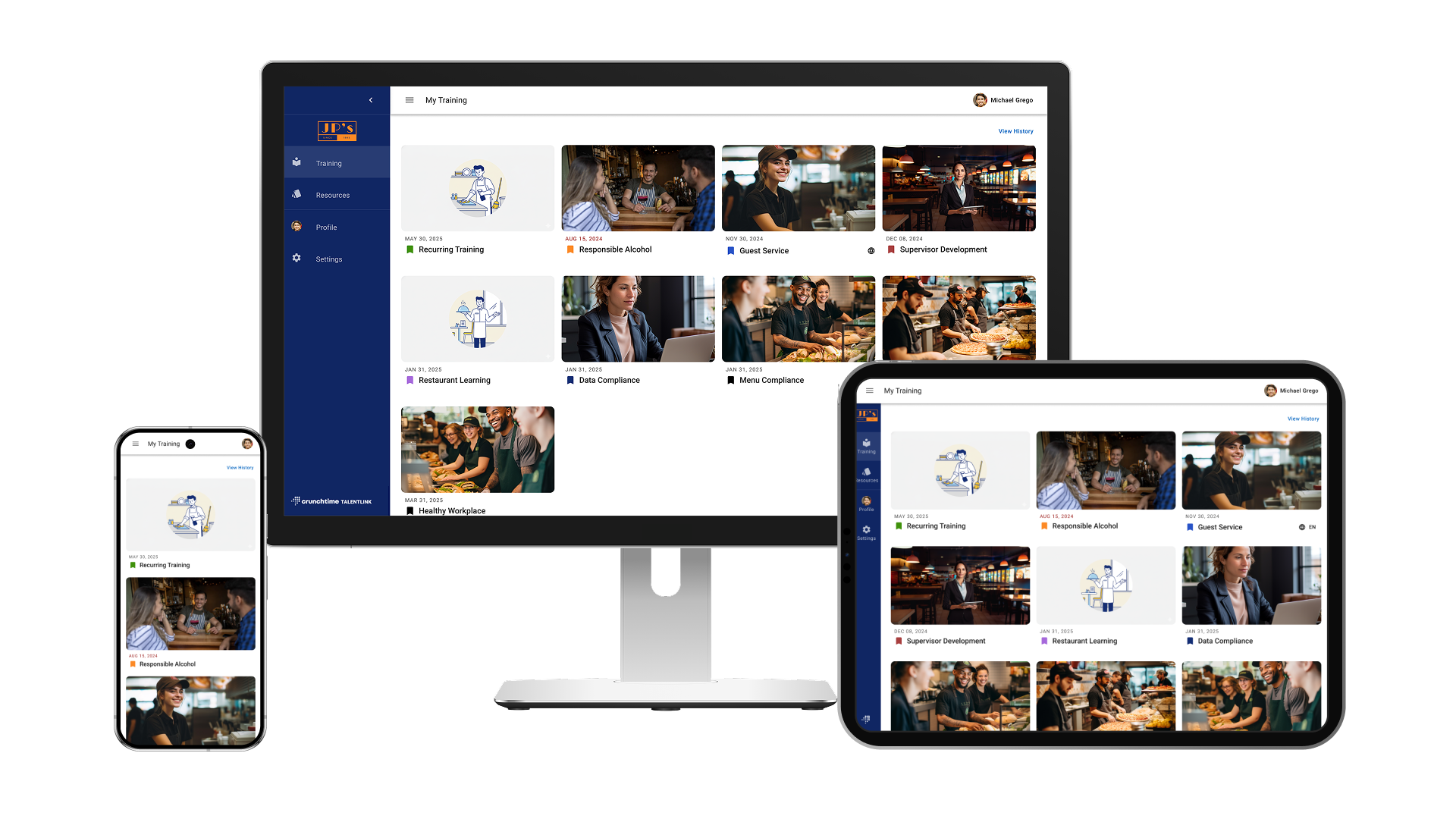
- User interviews revealed several underused features that diluted the overall experience, indicating opportunities to simplify and focus on the mobile app's primary areas: My training, QR code scan, and Resources.
- Heuristic Evaluation revealed inconsistent UI and incorrect use of affordances, which confused the user
User research clarified our two primary user profiles:
Learner
PERSONAL DEVICE

Learner
STORE DEVICE
Guiding Principles
Speed over innovation
I proposed leveraging Material UI library components for rapid development, and minimizing custom design work. I synced with the designers on the other products to ensure adherence to Crunchtime’s product family guidelines. Worked closely with engineers during the development phase to oversee design implementation, as no living Design System in scope.
Mobile first
Given that 68% of training is completed on tablets, and key customers increasingly requesting smartphone use across locations, the primary goal was to generate a solution that is adaptable and scalable across all platforms.
Design Execution
Streamlined navigation with user intent in mind
I organized the navigation around user intent so people can quickly find what they need and stay focused on completing their task. This approach would better facilitate scaling navigation as new features and user profiles are considered.
Talentlink allowed branded customization, but the fixed navigation text color caused poor readability on light backgrounds, creating accessibility issues. To maintain brand flexibility while ensuring legible navigation items, I proposed dynamically adjusting the text color based on the background color to ensure sufficient contrast to pass WCAG2 AA.
Ruthless prioritization
Geofencing was not providing the safety, so I held a brainstorming session to find a better way to ensure the correct use of the training content. The solution provided an attestation message to legally bind the proper use of the content within the store and schedule.
Data showed that only 16% of customers used the trophy case, a feature for recognizing learning and achievements, and that it received fewer than 45 monthly visits in the app. Usage on the web showed similar patterns, where the leaderboard drove higher engagement. The PM and I presented the case to stakeholders and retired the trophy case, reallocating efforts toward prioritizing features that users value the most.
Visual improvements
The design was inconsistent and not up to industry standards, so I explored and tested several designs until landing on the best version for the platform. I focused on creating a visual identity that matched Crunchtime’s product family, documenting the foundatiohns for a new design system
Providing clarity
Users were often confused because the Personal and Store app experiences looked alike and followed nearly identical installation steps. Therefore, I eliminated ambiguity by labeling the experience users were about to install. Additionally, I reduced user friction by showing menu options valid for store devices and exposing the login option in the menu to facilitate login and logout.
Project Outcomes
Constant communication with stakeholders and customers drove project's success.
- Deprecated 3 unused features in the app without major customer disruption: Messaging, Trophy case, and Geofencing.
- 13% increase in weekly app visits
- Up to 5-second loading time reduction on key screens
- 70% estimated drop in mobile app support tickets

Other Projects
Coppel Project
→
Suitexchange Project
→


