Boosting conversion by increasing user confidence during checkout
Coppel, a Mexican department store struggled with low checkout completion rates in their website. Collaborating across teams, we uncovered the frictions behind abandoned carts and turned them into a checkout experience that felt trustworthy and effortless.
+5%
CONVERSION RATE
*Rounded metric
+90
SCREENS IMPACTED
Company: TalentLink
Timeframe: 5 months
Role: Lead Product Designer
Team: Project manager, full-stack engineers, marketing manager
App Reach: ~30K users
Problem
Coppel.com, one of the largest Mexican department store chains, was struggling to convince users to complete their purchases online, relying heavily on in-person banking and retail experiences. With 80% of digital traffic coming from mobile devices, the online shopping experience was not helping users confidently complete their purchases.
Solution
Applying constant user research and iterative designs, Coppel website saw a 5.35% increase in CR across Coppel.com after implementing the new designs., a refreshed UI for the website that aligned with the constant evolution of the store.
Thanks to the collaboration with the Coppel team and coaching, we saw an elevation on the design teams fluency in Agile and UX

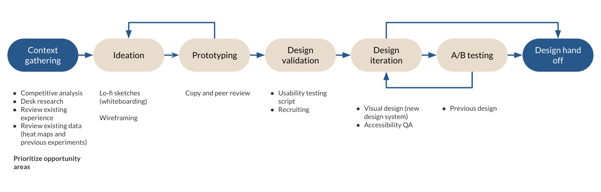
Design Process
To find a cadence that allowed us to move with ease and strike a balance between quickly iterating and validating assumptions while remaining collaborative with Coppel's team, we agreed to work on a 2-week sprint.
Daily syncs and weekly presentations to the rest of the team allowed us to work in parallel while providing visibility of our work as we split the sections.
Opportunity
The online retail was rapidly expanding in Mexico, led by international players. Coppel offered a unique blend of banking and retail services.
Building an online platform that delivers a consistent experience across devices and simplifies the experience could optimize the checkout process on mobile web.
Measurement for success:
- Reduce the loading time of images by 30%
- Reduce the time an item stays on the cart from 7 to 1 day
- Increase conversion rate by 8% (CR)
- Maintain WCAG level AA
Research Analysis
The team defined three primary user groups: digital clients, guests, and Coppel employees, with a core focus on middle-income families who typically paid with a Bancoppel card or cash. Research showed that 80% of Mexican buyers avoid saving card details and are highly price-sensitive, so the experience needed to highlight transparent pricing and persuasive product details at every step.
Employee
A person that works at Coppel and has certain benefits, such as discounts
E-client
A registered user in the platform and at the store
Guest
A person who doesn’t own a Coppel account
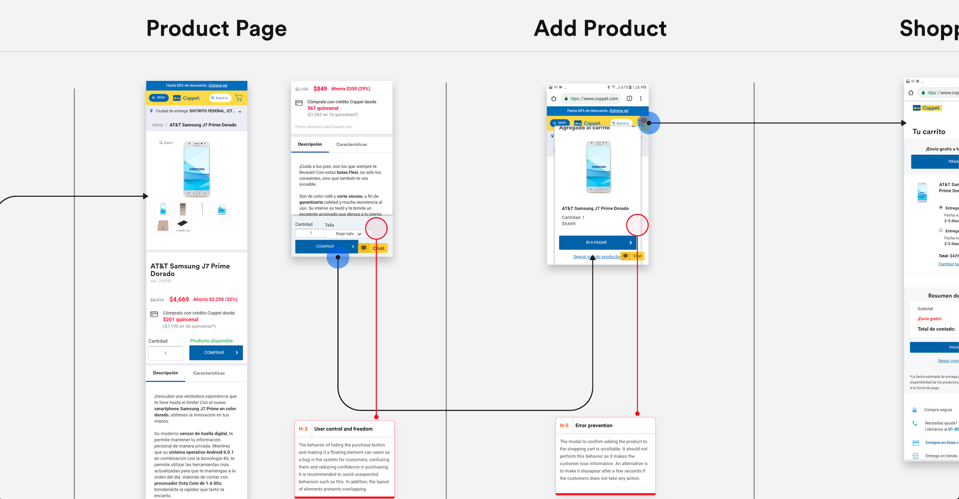
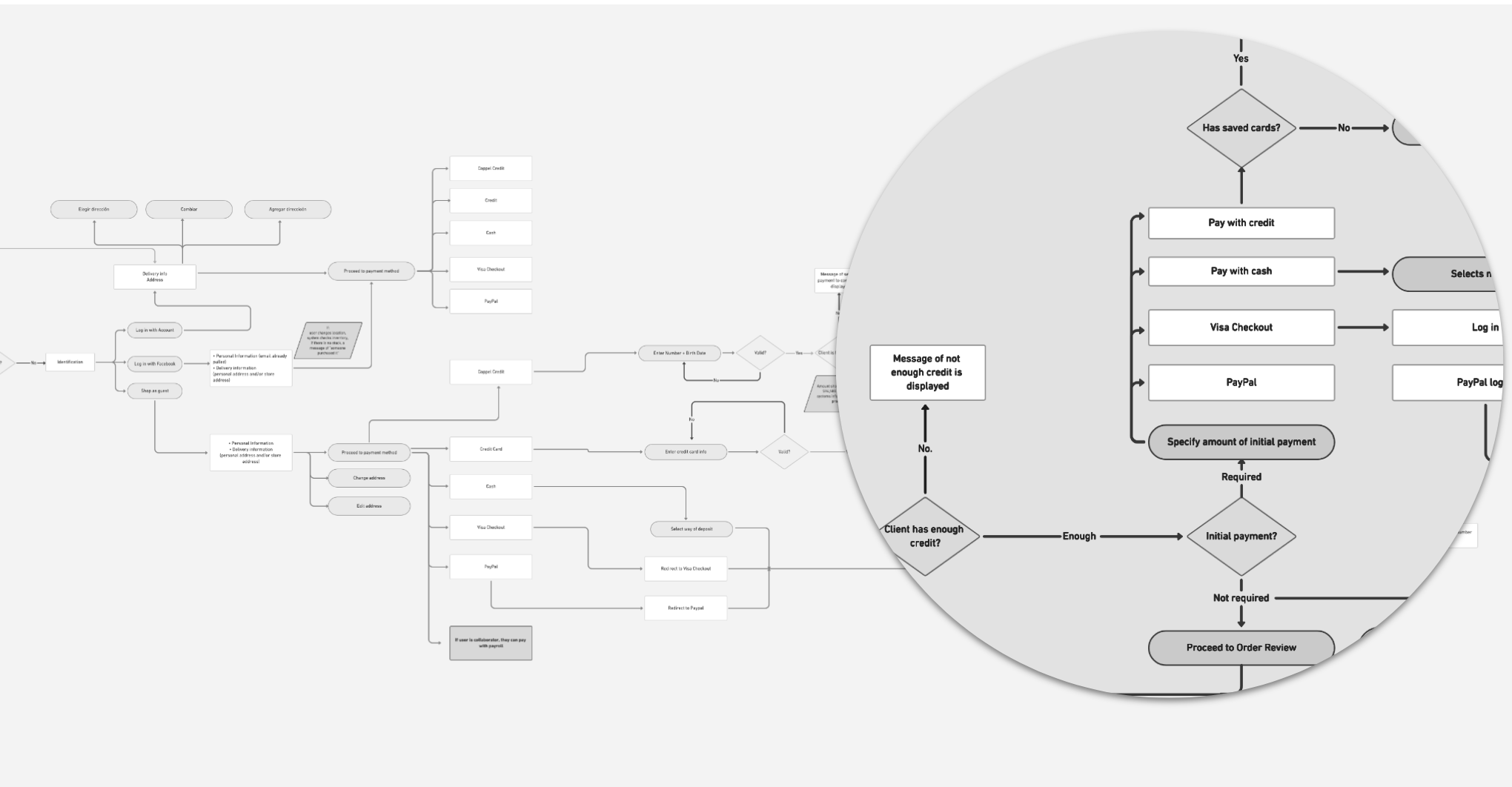
A prior heuristic evaluation identified that the purchasing journey was hindered by inconsistent design and repeated information, which unnecessarily increased cognitive load and added confusion.
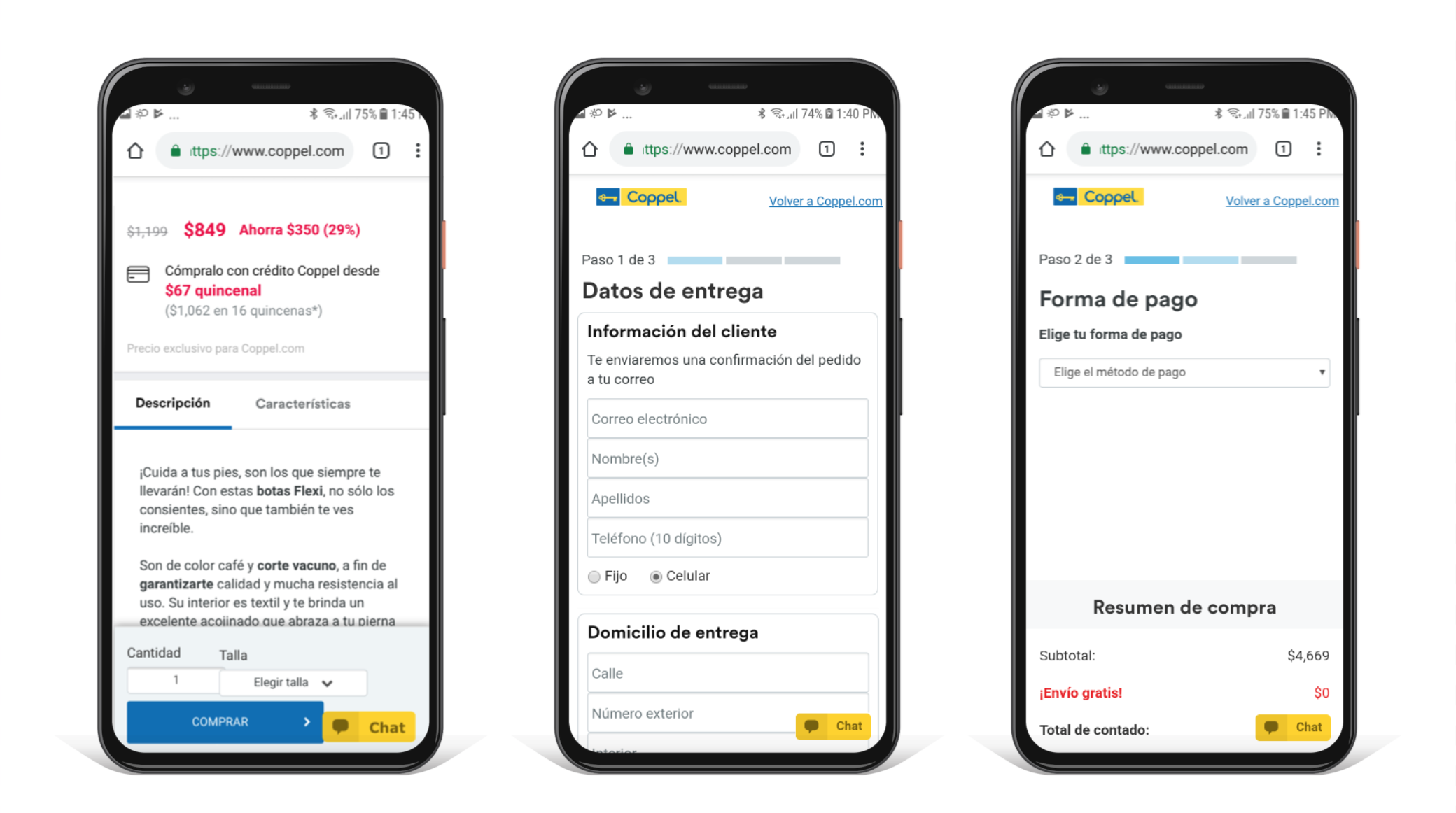
The checkout process required repeated data entry through lengthy, overwhelming forms, creating a slow and frustrating experience for potential buyers. Outdated designs and poor information hierarchy made screens hard to scan, while confusing billing details eroded trust and interrupted the funnel.
33%
of visitors abandoned the checkout process during payment method selection
These findings combined shaped key decision points and helped us prioritize redesigning the payment selection process for speed and transparency, reducing friction and abandonment.
Purchase Redesign
Leveraging the insights from user profiles provided by the data analytics team, I recognized copy as a critical driver of conversion success. Partnering closely with copywriters, I aligned the brand tone and eliminated the sophisticated language to build trust and reduce drop-off.
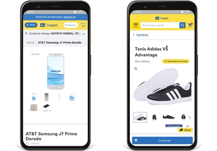
Product Page
Prioritized visual hierarchy for rapid decision-making:
- Zoom-in on product photos for detail inspection
- Sticky "Purchase" CTA for frictionless action
- Exposed item attributes signaling real-time availability
- Integrated stepper for intuitive quantity selection
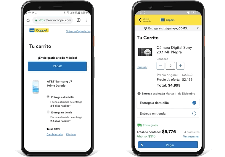
New Cart Experience
Optimized the scannability of the cart.
- Prominent pricing and key details front-and-center
- Item editing in cart for quick adjustments
- Consistent headers across checkout
- Sticky summary bar surfacing shipping cost, delivery date, and total savings.
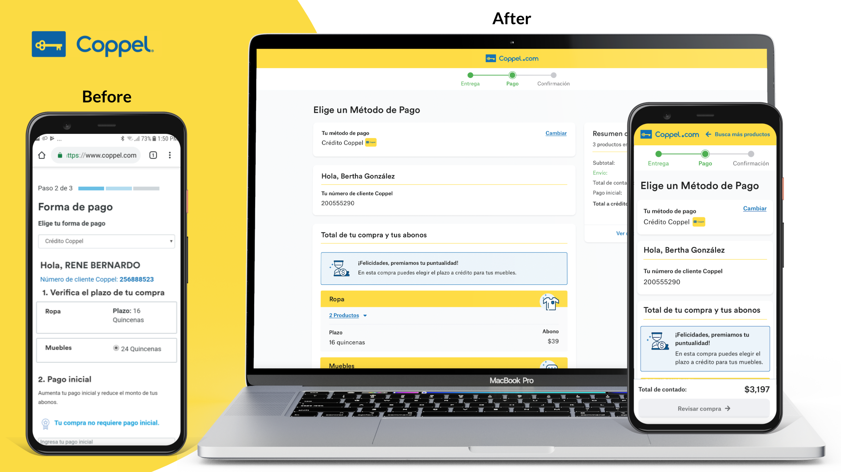
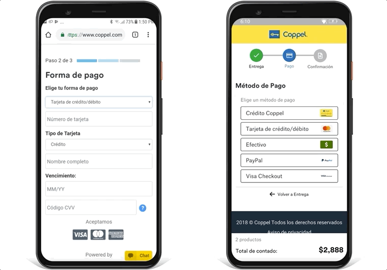
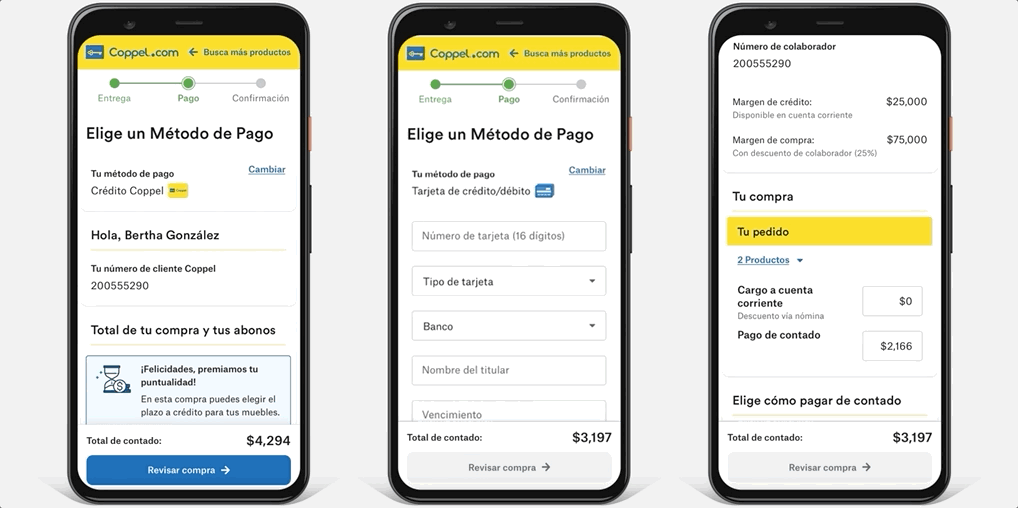
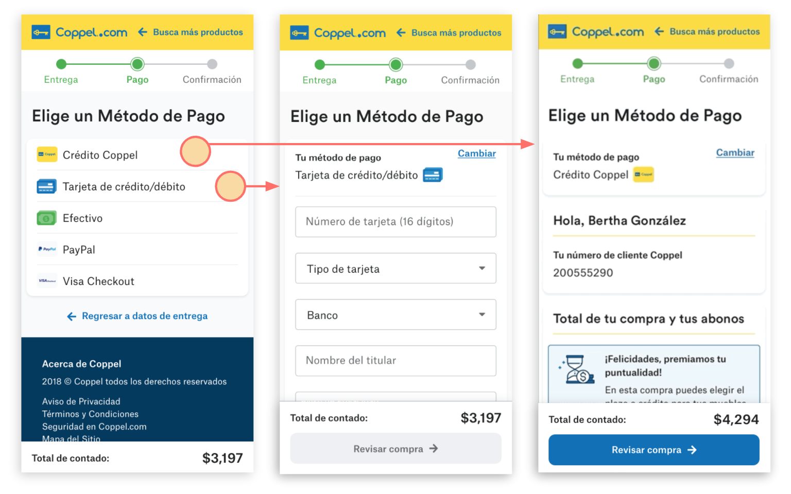
Payment method
Removed redundant information, such as order summary, delivery info, and contact details, surfacing only payment details. Exposing the payment options in this step enabled tailoring payment options for all user profiles: guests, digital clients, and Coppel employees.
Talking With Customers
We built prototypes for usability testing, then used the findings to inform A/B experiments. Payment method selection screens emerged as a standout win: users were able to choose a payment method faster with zero confusion.
Breaking down the payments into two steps: method selection first, then billing and store pickup, drove positive results. A/B tests showed a 3.17% conversion lift, boosting completed orders, average order value, and revenue.
Project Outcomes
While mobile devices accounted for 80% of Coppel's traffic, the design incorporated fluid, responsive layouts across tablet and desktop.
The Coppel team initially had low expectations for us, acknowledging the ambitious requests and tight deadlines that had led to the failure of previous groups. Despite this, we not only met but exceeded their expectations, demonstrating a profound commitment to our craft in just four months.
- 5.35% increase in CR across Coppel.com after implementing the new designs
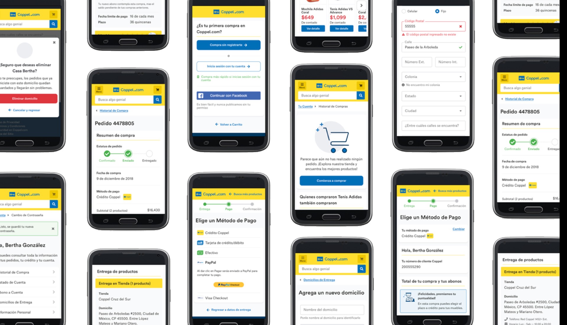
- Redesigned +90 screens of Coppel.com
- Provided Coppel with a scalable, omnichannel Design System
- Elevated the Coppel’s design team's fluency in Agile and UX

Other Projects
TalentLink Project
→
Suitexchange Project
→


